
Case Study
South Lake Tahoe Cancer League
Brand Refresh & Website Design
Bringing Compassion and Community Together Through Design
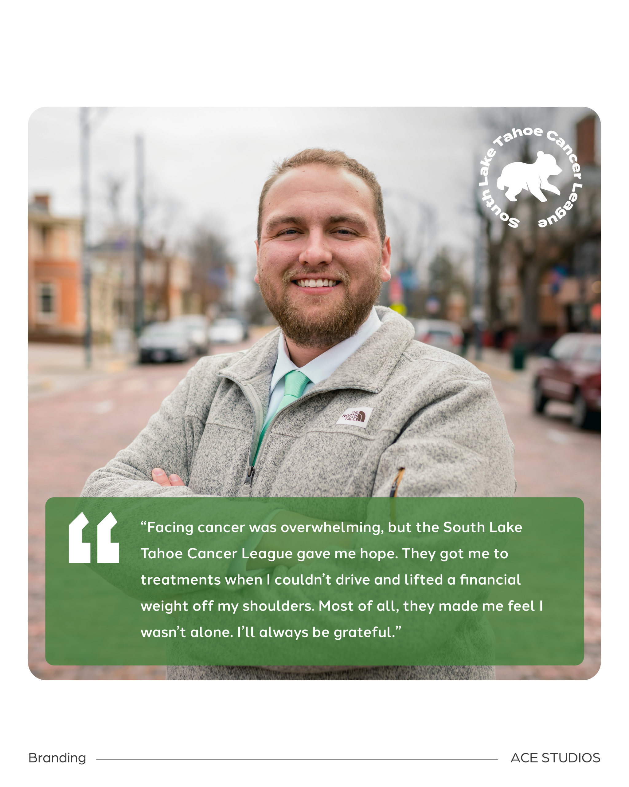
For more than four decades, the South Lake Tahoe Cancer League (SLTCL) provided a lifeline to individuals and families navigating cancer in the Lake Tahoe basin. Powered entirely by volunteers, the nonprofit offered transportation to medical appointments, financial assistance, and compassionate support to those facing some of life's most difficult challenges.
With such an important mission, SLTCL needed a brand and digital presence that reflected the heart of its work while making it easier for community members to access services, contribute financially, and get involved.
Ace Studios partnered with the South Lake Tahoe Cancer League to refresh its visual identity and redesign its website, creating a more welcoming, accessible, and user-friendly experience for the people who depended on its services.
The Challenge
For a volunteer-driven nonprofit, making it easy for people to find information and take action is essential. South Lake Tahoe Cancer League's existing brand and website weren't fully reflecting the compassion, credibility, and community connection that had defined the organization for decades.
Its visual identity lacked consistency across digital and printed materials, while its website presented challenges for visitors trying to request assistance, make a donation, or volunteer.
Lengthy application forms, limited mobile functionality, and unclear calls to action created unnecessary barriers for individuals seeking support.
The challenge was to create a cohesive, approachable brand and a digital experience that simplified these important interactions without losing the personal, community-centered spirit of the organization.
Our Approach
Ace Studios approached the project with a focus on compassion, clarity, and accessibility.
We began by working with organizational stakeholders to better understand SLTCL's mission, audiences, and the challenges people encountered when interacting with its existing website.
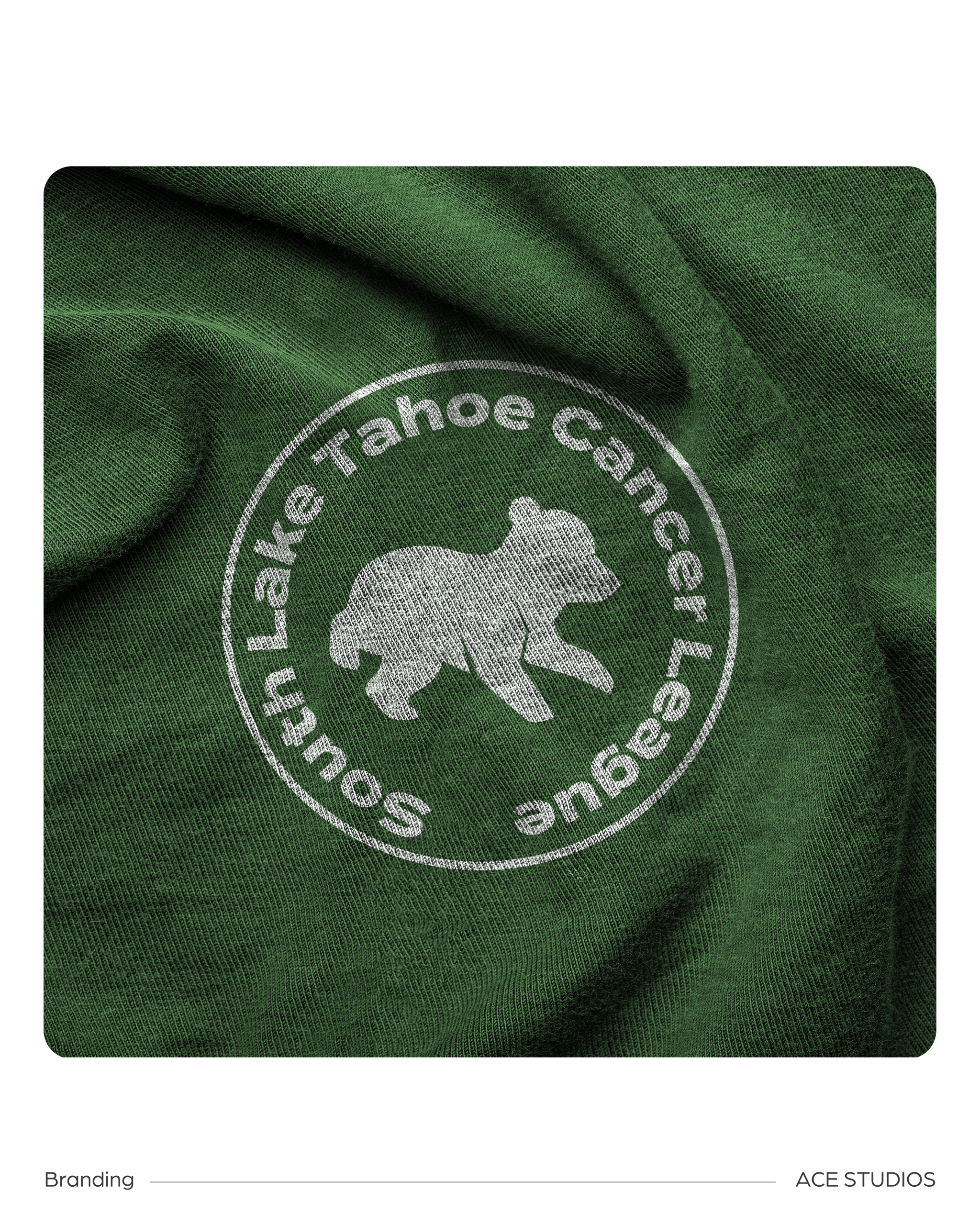
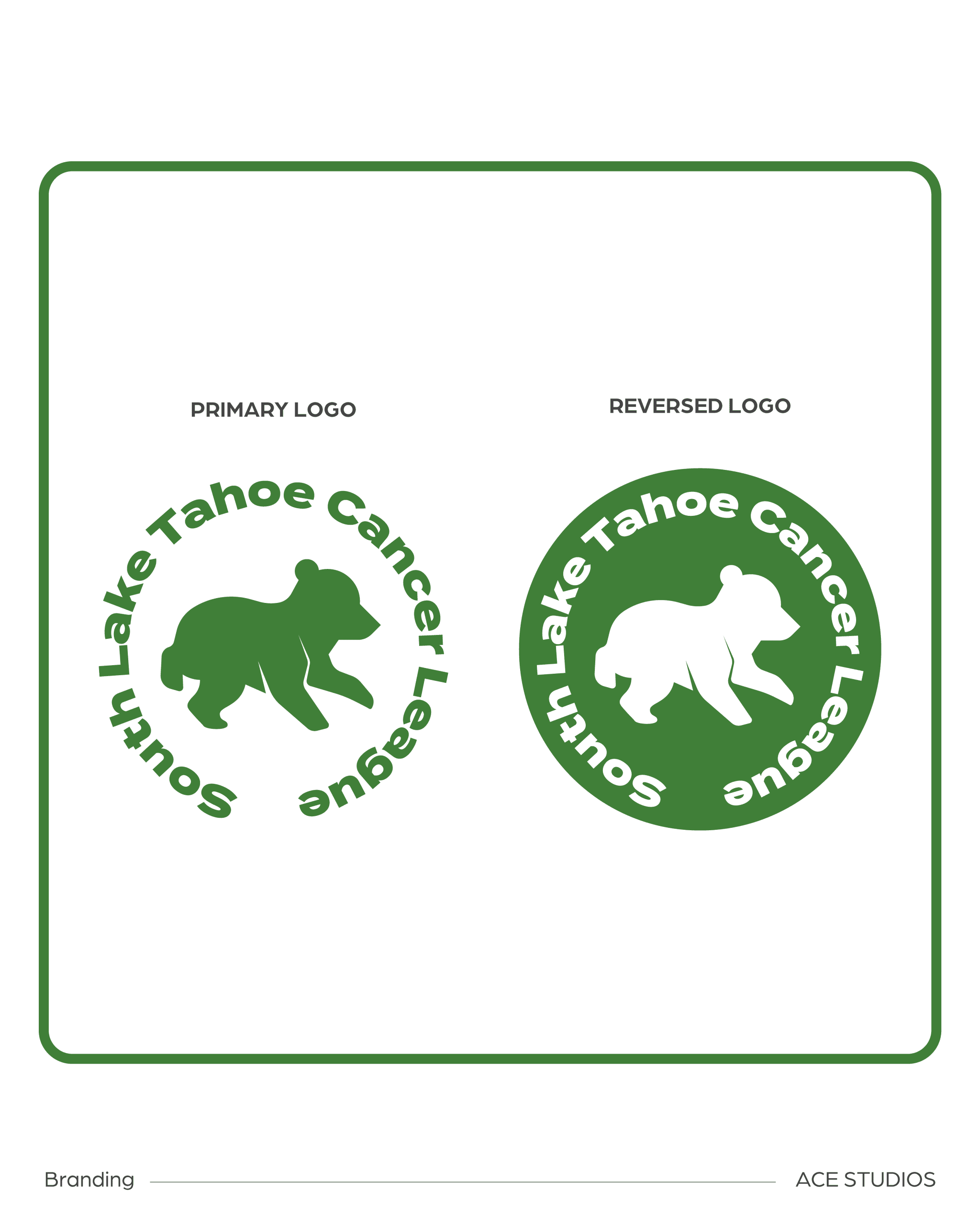
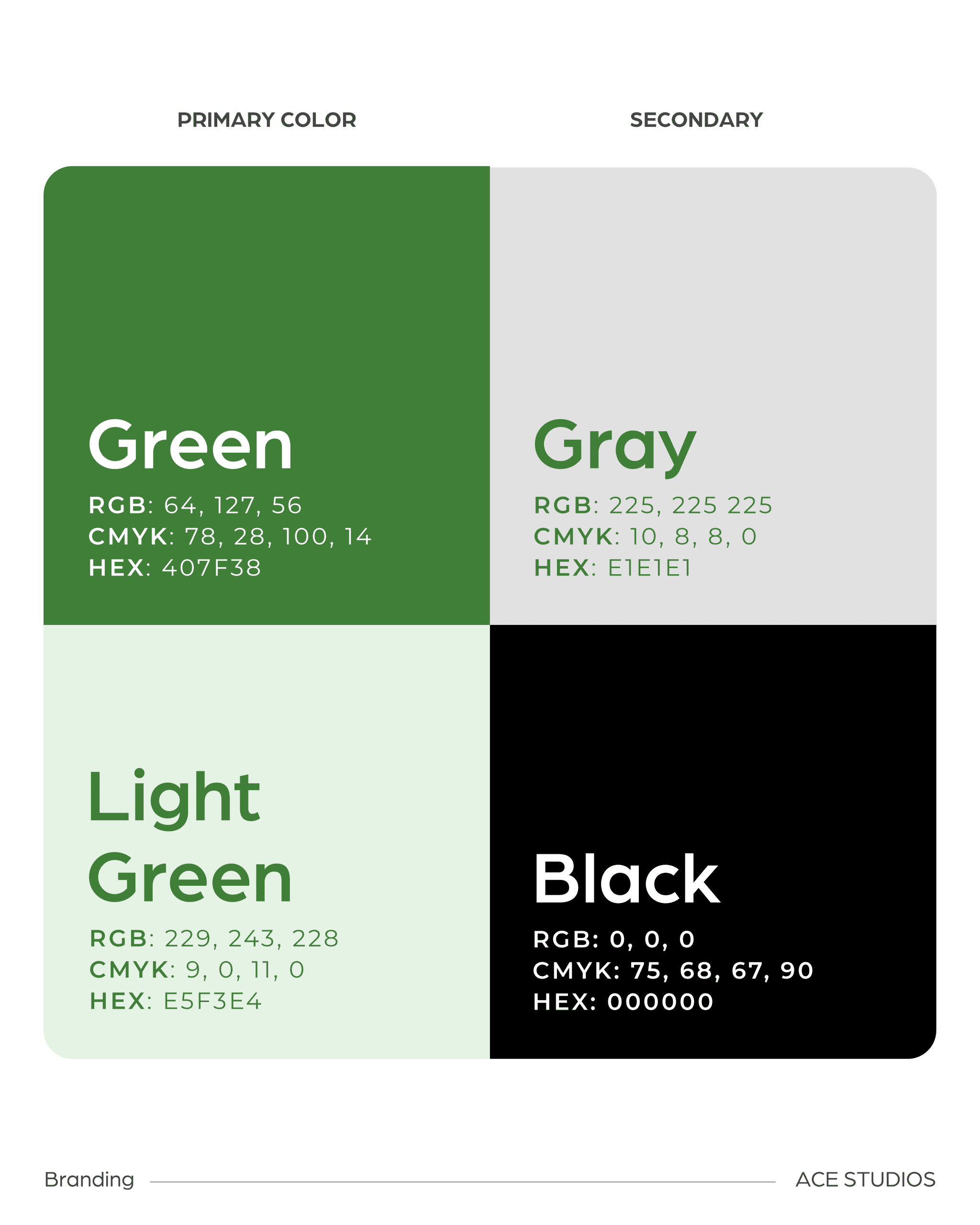
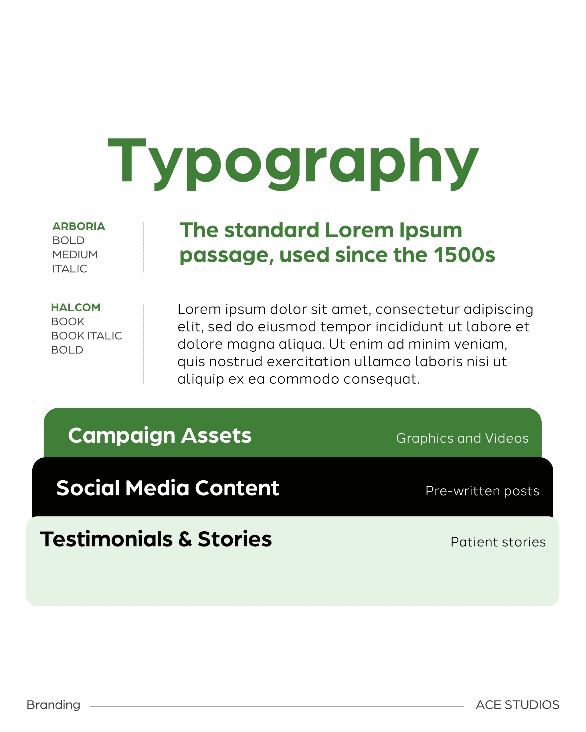
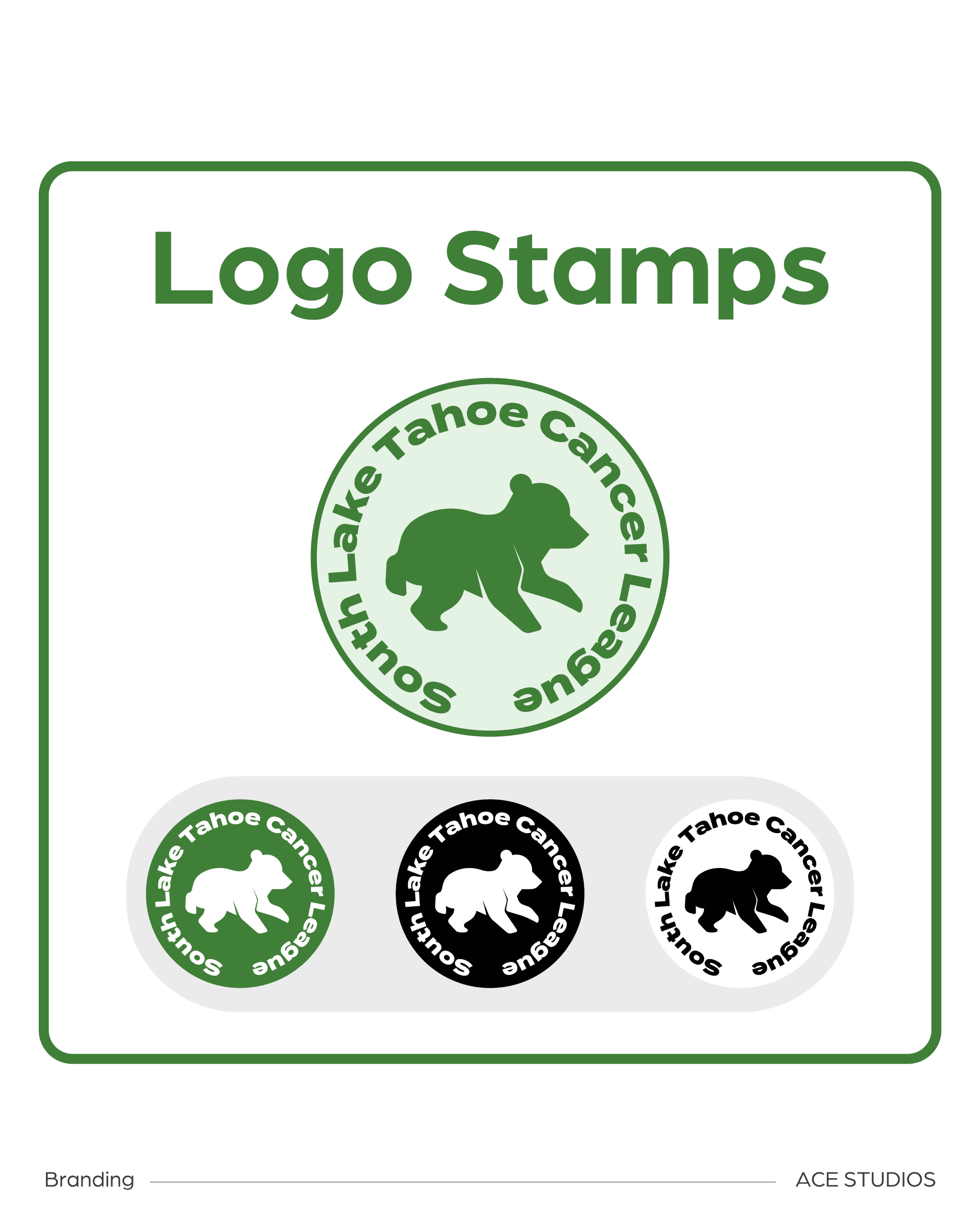
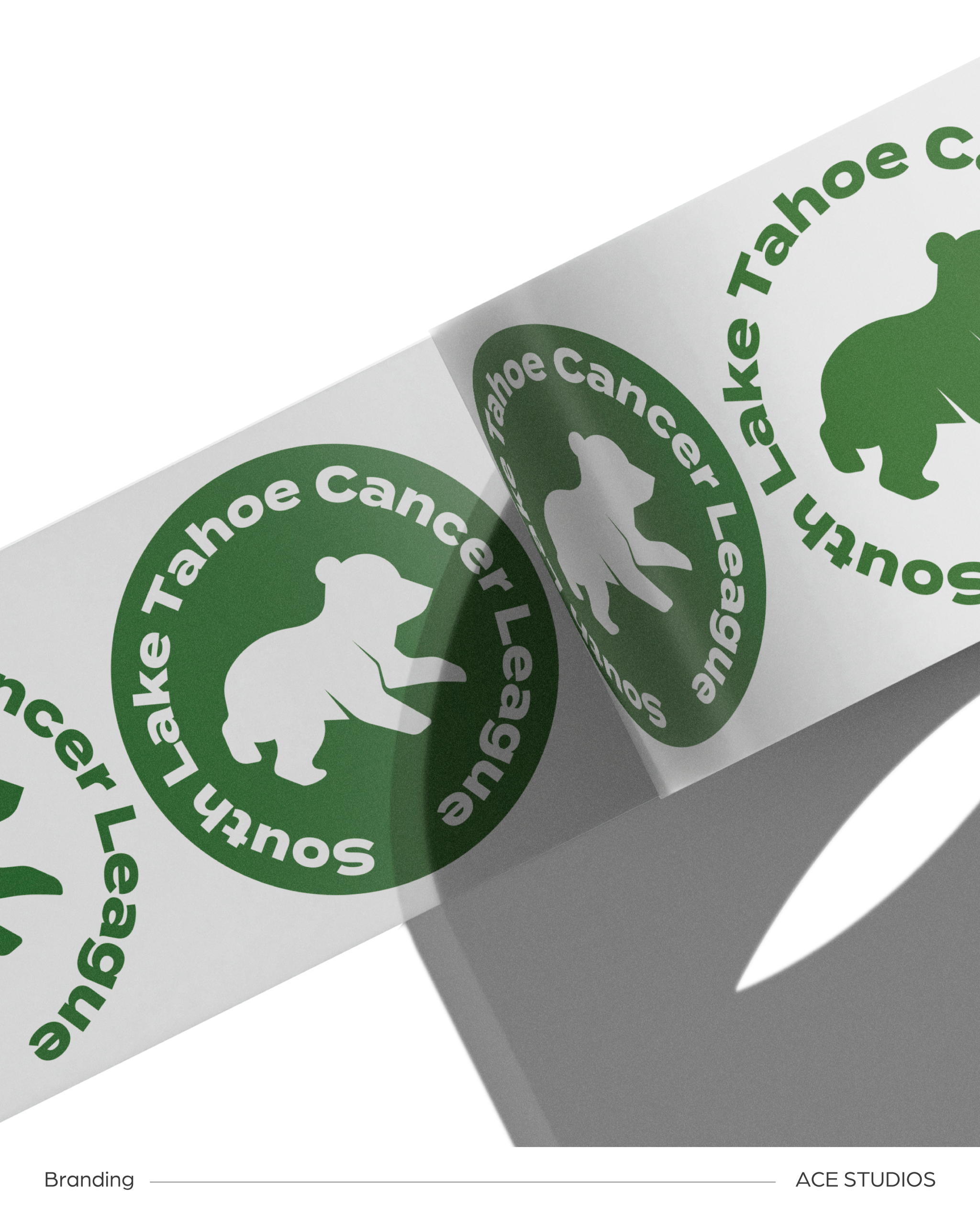
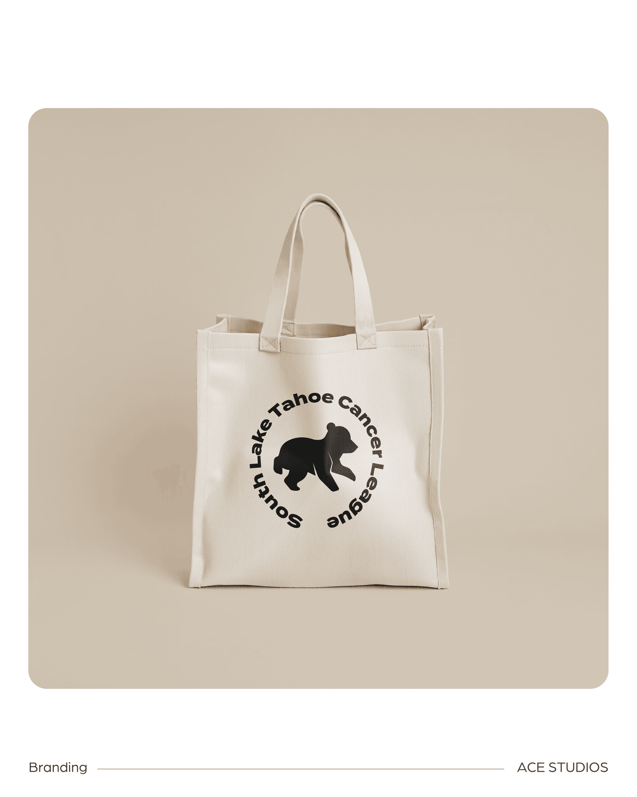
From there, our team refreshed the organization's visual identity, introducing a more cohesive design system that balanced warmth and approachability with professionalism. A friendly bear icon created a recognizable connection to the Lake Tahoe community, while updated colors and typography established consistency across the brand.
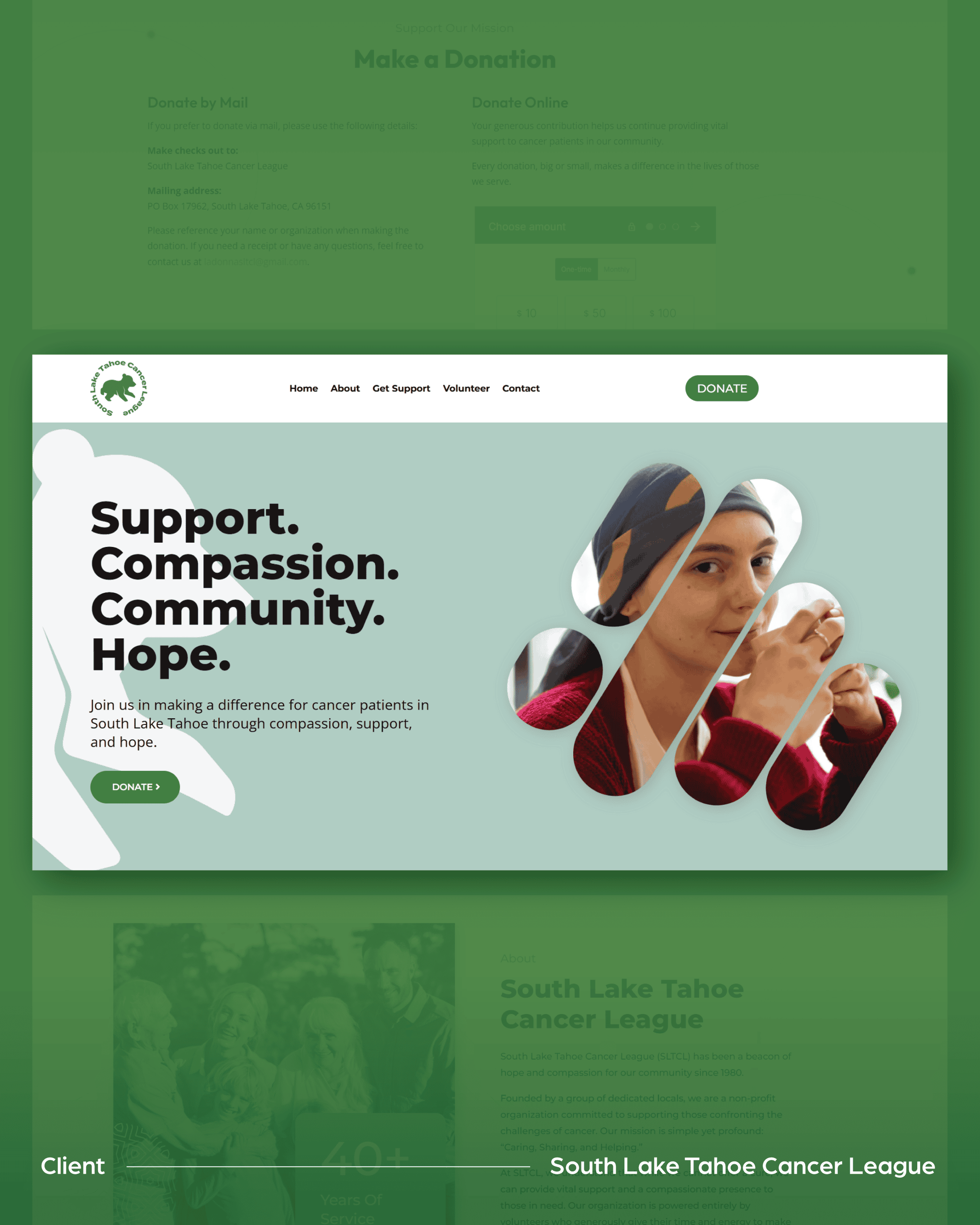
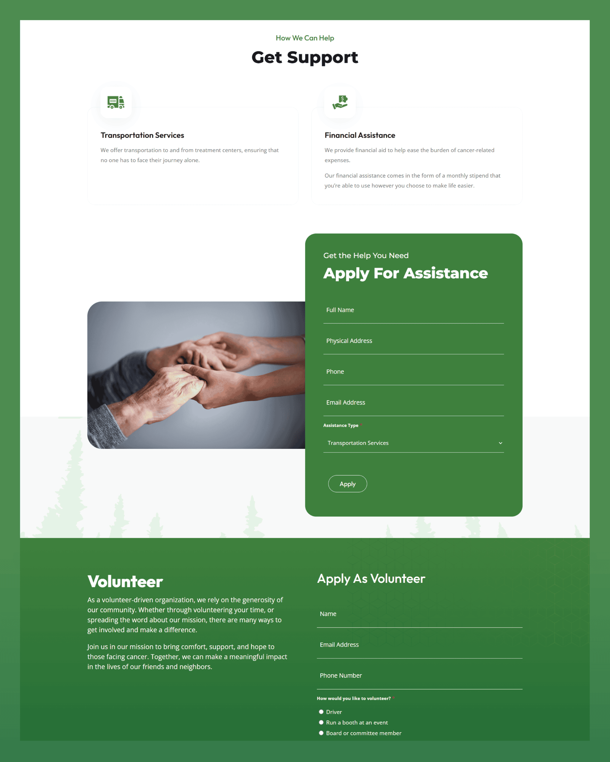
For the website, we prioritized intuitive navigation, mobile responsiveness, and simplified pathways for requesting assistance, volunteering, and donating.
Every design decision centered on one goal: making it easier for the organization to connect people with the help they needed.
What We Created
Ace Studios brought the South Lake Tahoe Cancer League's refreshed identity and digital experience to life through:
Brand refinement and visual identity
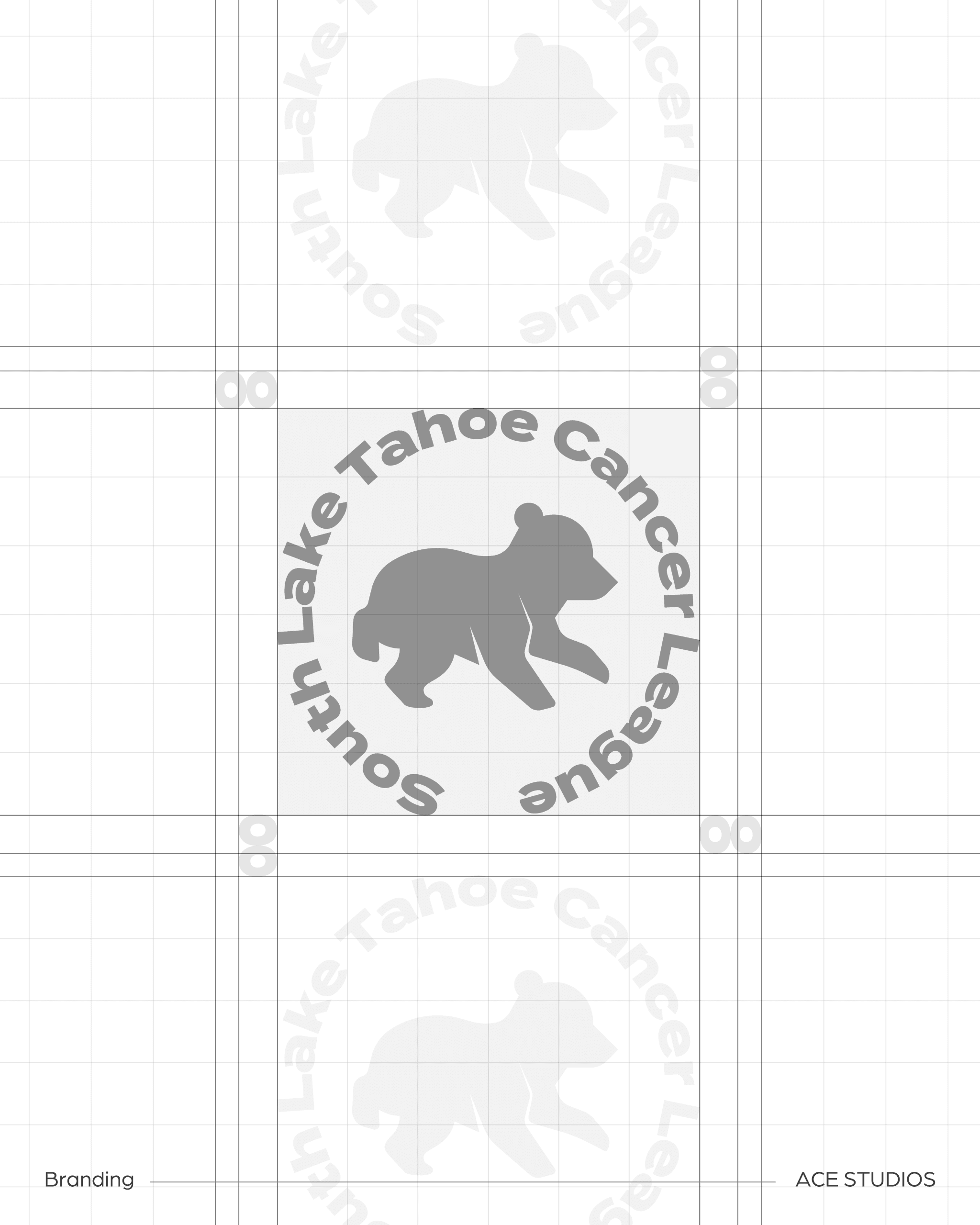
We refreshed the organization's logo with a welcoming bear icon inspired by the Lake Tahoe community, complemented by a cohesive color palette and modern typography that communicate compassion, strength, and trust.
Website design and development
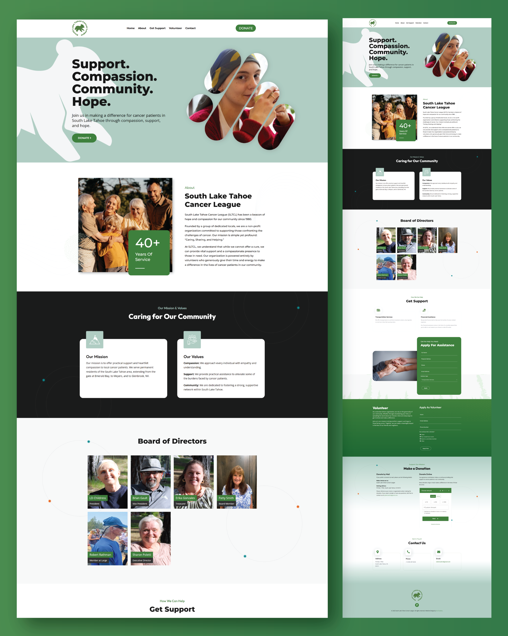
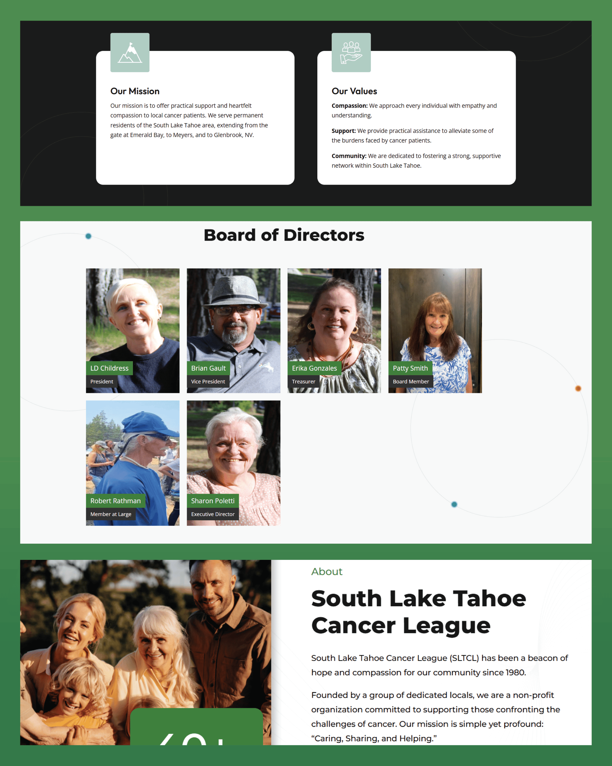
Our team designed and developed a responsive WordPress website with a clean, approachable layout and intuitive navigation, making essential information easier to access across desktop and mobile devices.
Improved assistance and volunteer applications
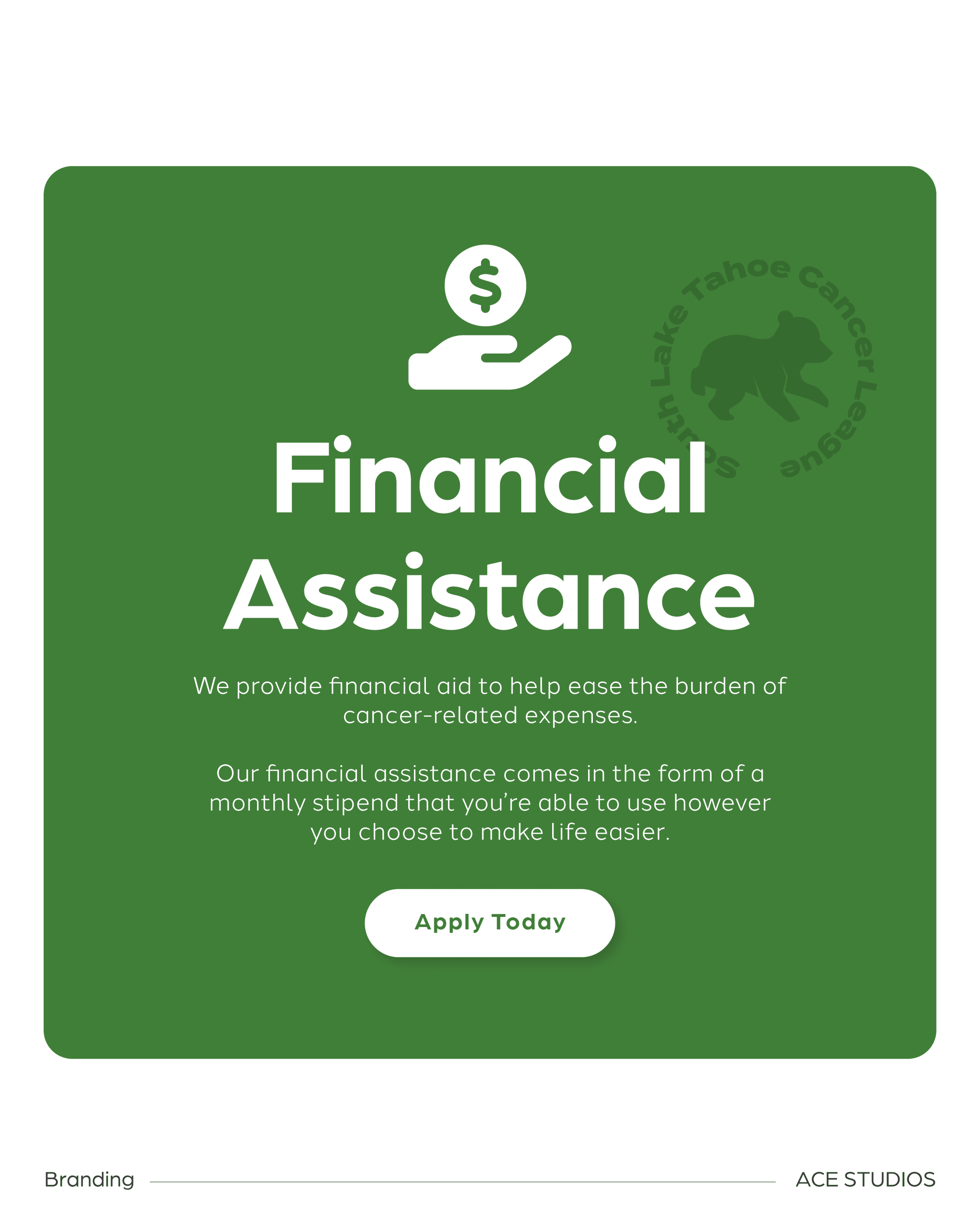
We simplified previously complex application processes with streamlined online forms, reducing unnecessary steps for individuals requesting support and community members interested in volunteering.
Donation accessibility and calls to action
We introduced clear, prominent pathways for donating, applying for assistance, and getting involved, helping visitors quickly identify opportunities to support or benefit from the organization's mission.
Website accessibility and performance
We incorporated accessibility best practices, including readable typography, accessible color contrast, structured content, and optimized imagery to create a more inclusive and efficient browsing experience.
Content management and brand consistency
We developed custom WordPress templates that maintained a consistent visual experience while giving the organization's volunteer leadership a manageable platform for updating information and communicating with its community.


The Result
South Lake Tahoe Cancer League received a refreshed brand and modern website that better reflected the compassion, dedication, and community spirit behind its mission.
The redesigned digital experience brought the organization's services, volunteer opportunities, and donation pathways together in one accessible destination, making it easier for visitors to find information and take meaningful action.
Beyond the visual transformation, the project helped remove unnecessary barriers between the organization and the people it served, while providing its volunteer leadership with a more streamlined way to manage its online presence.
For an organization built around caring, sharing, and helping, the result was more than a new look. It was a digital experience designed to make compassion easier to put into action.