
Case Study
Pink Sonoma Rosé Fest
Brand Naming & Visual Identity
A Fresh Pour for Sonoma's Pinkest Party
In the heart of California wine country, Out in the Vineyard (OITV) has created a welcoming space where wine, community, and celebration come together. Through its LGBTQ+ inclusive events, the organization brings people together to experience the best of Sonoma Valley while supporting causes that make a difference.
One of its signature celebrations, formerly known as Pink Sonoma Saturday, brought together more than two dozen wineries, local food vendors, and guests dressed in their favorite shades of pink for a day dedicated to rosé wine.
But as the event evolved, its name and visual identity needed a refresh that could better capture the experience while allowing room for future growth.
Ace Studios partnered with Out in the Vineyard to rename and rebrand the event, creating a playful, recognizable identity that celebrated its personality and gave the festival a fresh start.
The Challenge
A great event name should do more than tell people where to be. It should create excitement, communicate what makes the experience special, and remain relevant as the event grows.
For Out in the Vineyard, the name Pink Sonoma Saturday had become limiting. By tying the event to a specific day of the week, it restricted the organization's flexibility to expand or evolve the celebration in future years.
The name also didn't fully communicate what attendees could expect: a lively rosé wine festival featuring wineries from across Sonoma Valley, local food, and a welcoming atmosphere.
OITV needed a name that was more descriptive, memorable, and adaptable, paired with a visual identity that captured the festival's fun, inclusive personality.
The challenge was to preserve the recognition associated with the existing event while introducing a refreshed identity that could support its next chapter.
Our Approach
Ace Studios approached the project with a focus on creativity, flexibility, and the distinctive spirit of the festival.
We began by exploring naming concepts that would retain the recognizable Pink Sonoma identity while better communicating the event's purpose and experience.
After developing and evaluating several options, we landed on Pink Sonoma Rosé Fest, a name that immediately established the event as a wine-focused celebration without restricting it to a particular day of the week.
With the new name established, our creative team developed a visual direction that embraced the festival's playful personality.
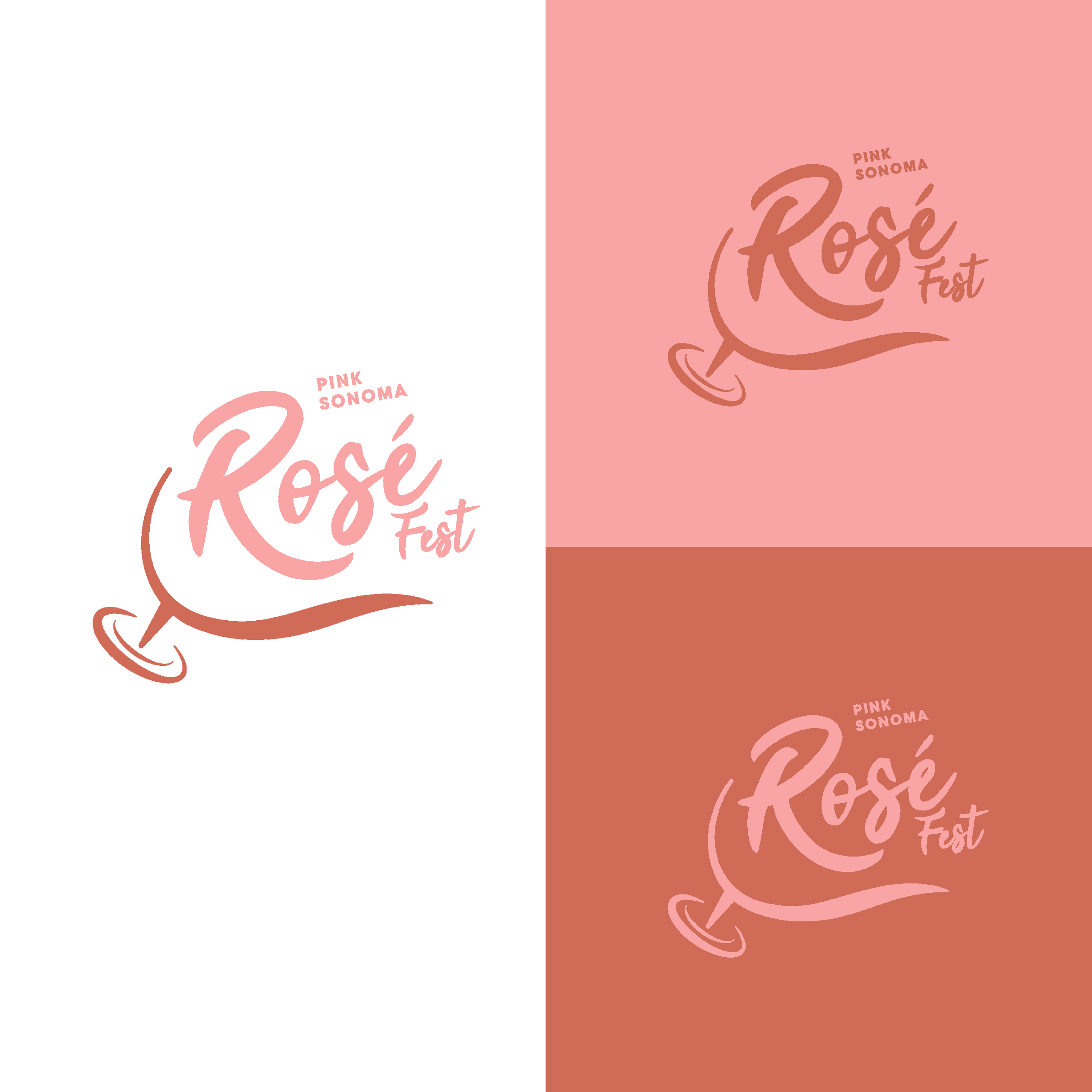
Rather than taking a traditional approach to wine industry branding, we leaned into the event's celebratory nature, creating a whimsical logo that felt approachable, energetic, and unmistakably fun.
The result was an identity that connected the festival's established reputation with a more flexible and expressive future.
What We Created
Ace Studios refreshed the Pink Sonoma experience through:
Event naming and brand strategy
We explored multiple naming concepts before developing Pink Sonoma Rosé Fest, a more descriptive and adaptable name that communicated the festival's focus while creating opportunities for future growth.
Logo design and visual identity
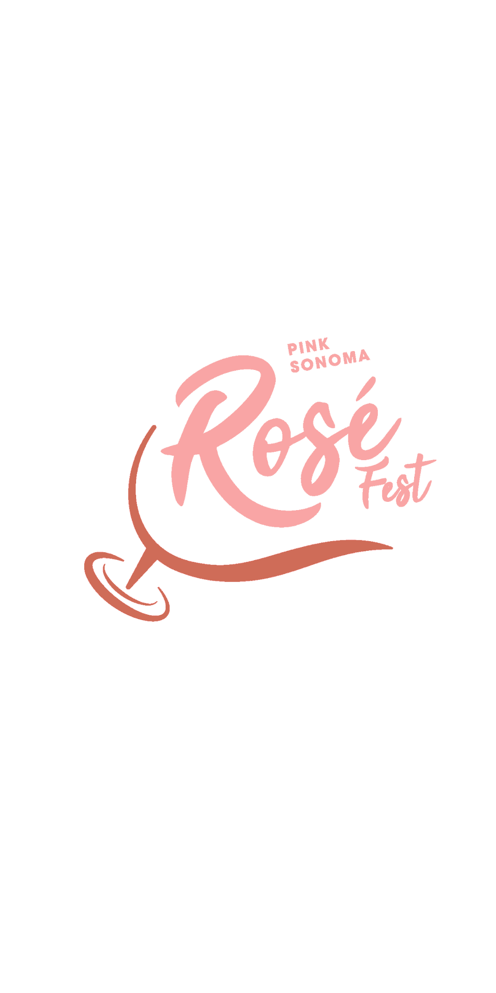
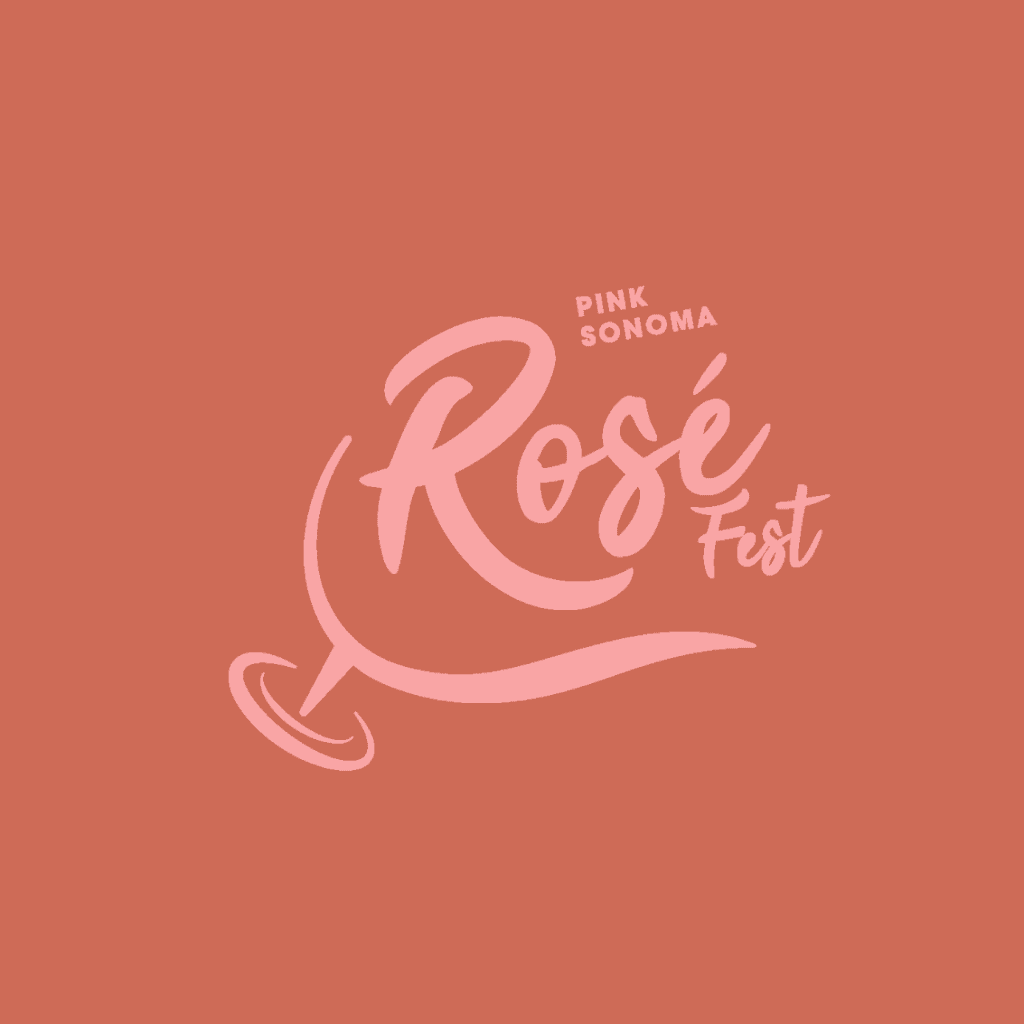
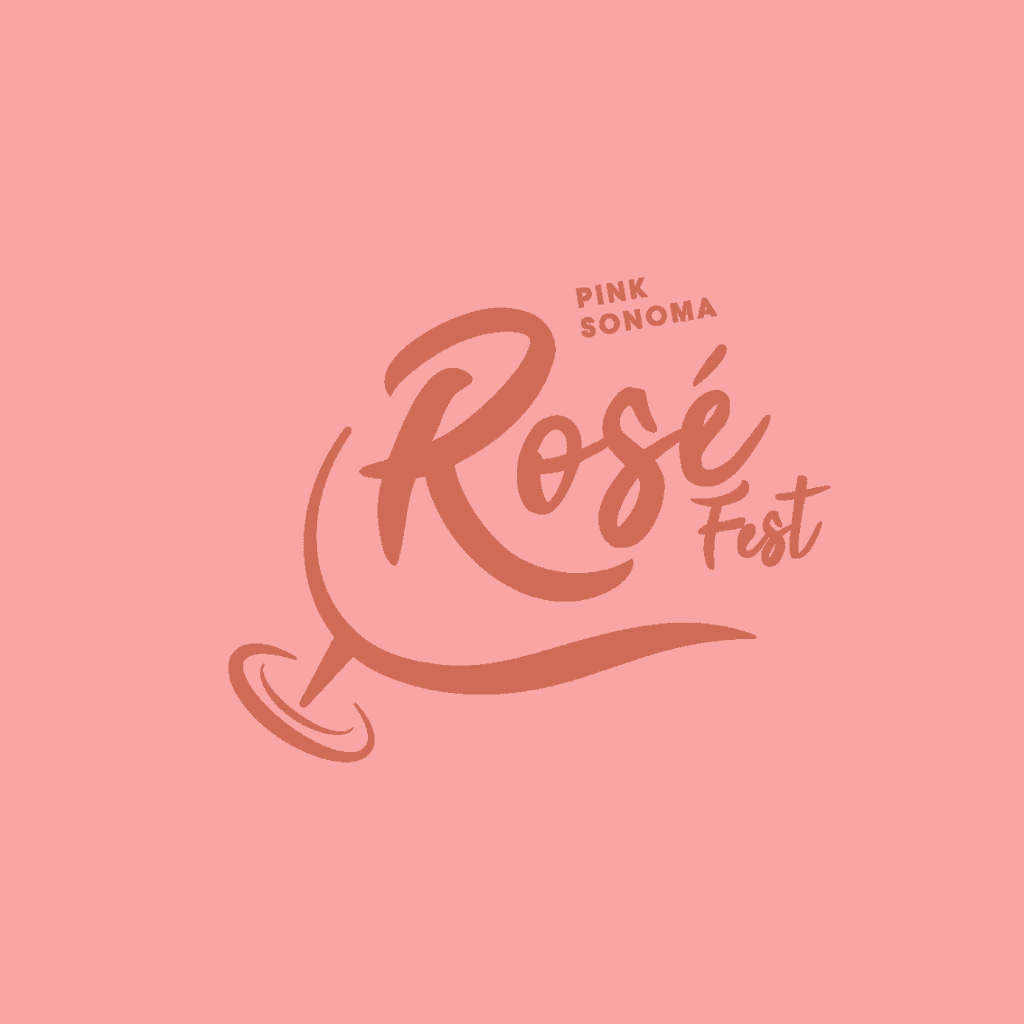
Our team created a playful, whimsical logo that reflected the spirit of the event and established a recognizable identity for the refreshed festival.
Brand positioning
We helped clarify how the event was presented to prospective attendees, emphasizing its identity as a rosé wine festival rather than a celebration tied to a specific day of the week.
Creative direction
We developed a visual approach that embraced the festival's lighthearted personality, creating an identity suited to an event centered on wine, community, and celebration.


The Result
Pink Sonoma Rosé Fest emerged with a refreshed name and visual identity that more clearly communicated the experience attendees could expect.
By moving beyond the original Pink Sonoma Saturday name, Out in the Vineyard gained greater flexibility to evolve the event without losing its established recognition within the Sonoma wine community.
The new logo brought a playful personality to the festival, complementing its welcoming atmosphere and the spirit of celebration that made the event special.
The refreshed identity was enthusiastically received by the client, giving the organization a creative foundation for promoting the festival and connecting with future attendees.
For Ace Studios, the project demonstrated how a relatively simple naming and design challenge could make a meaningful difference in how an event was positioned.
And for Pink Sonoma Rosé Fest, the next chapter came with a new name, a fresh look, and plenty of reasons to raise a glass.