
Case Study
The Community Food Pantry of Reno/Sparks
Website Redesign & Creative Development
A Fresh Look for a Mission That Feeds Thousands.
For thousands of Northern Nevada residents, access to nutritious food can make a meaningful difference in their daily lives. The Community Food Pantry of Reno/Sparks has worked to address food insecurity by providing essential food assistance to individuals and families facing difficult circumstances.
Serving more than 25,000 people annually at the time of the project, the nonprofit played an important role in helping community members access food and support when they needed it most.
But as the organization prepared for a major fundraising event, its outdated website was creating unnecessary challenges. Slow performance, cluttered content, and confusing navigation made it harder for visitors to learn about the pantry's mission and find ways to help.
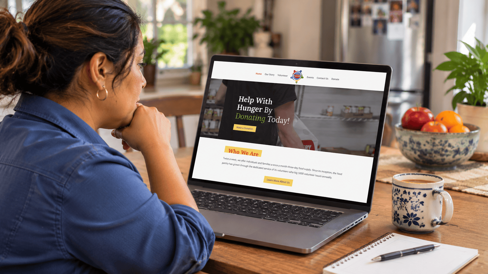
Ace Studios partnered with The Community Food Pantry of Reno/Sparks to redesign its website, improve its messaging, and explore a refreshed visual identity that could support the organization's future communications.
The Challenge
For organizations addressing food insecurity, clear communication is essential. People seeking assistance need to quickly find information about available resources, while donors and community supporters need to understand how their contributions can make a difference.
The Community Food Pantry of Reno/Sparks faced several challenges with its existing website.
Slow loading times made the browsing experience frustrating, while cluttered content and an outdated layout prevented important information from receiving the attention it deserved.
The site's navigation was also difficult to use, creating additional barriers for visitors trying to learn about the organization's services, fundraising efforts, and opportunities to get involved.
With a major fundraiser approaching, the organization needed a more effective digital presence that could communicate its mission and provide a better experience for supporters.
The pantry also had an established visual identity, but there was an opportunity to explore how its branding might evolve in the future.
The challenge was to modernize the organization's website while respecting its existing identity, improving access to information, and creating a stronger foundation for community engagement.
Our Approach
Ace Studios approached the project with a focus on simplicity, clarity, and the practical needs of a community-serving nonprofit.
We began by evaluating the pantry's existing website and identifying the issues that were making it difficult for visitors to find relevant information.
Rather than treating the redesign as a purely aesthetic update, we focused on improving the overall structure of the website.
Our team reorganized content and developed a more intuitive information architecture, helping visitors navigate the organization's mission, services, and opportunities to provide support.
We also refined the website's messaging, making important information easier to understand while emphasizing the pantry's role in addressing food insecurity throughout Northern Nevada.
The visual direction prioritized a cleaner, more welcoming presentation that allowed the organization's mission and community impact to take center stage.
Alongside the website redesign, Ace Studios explored a refreshed brand identity, developing creative concepts that offered a potential new direction for the organization's visual presence.
Although the pantry ultimately decided to retain its existing logo because of a recent investment in branded vehicle graphics, the proposed concepts provided inspiration for how its identity could evolve in the future.
What We Created
Ace Studios supported The Community Food Pantry of Reno/Sparks through:
Website Strategy and Information Architecture
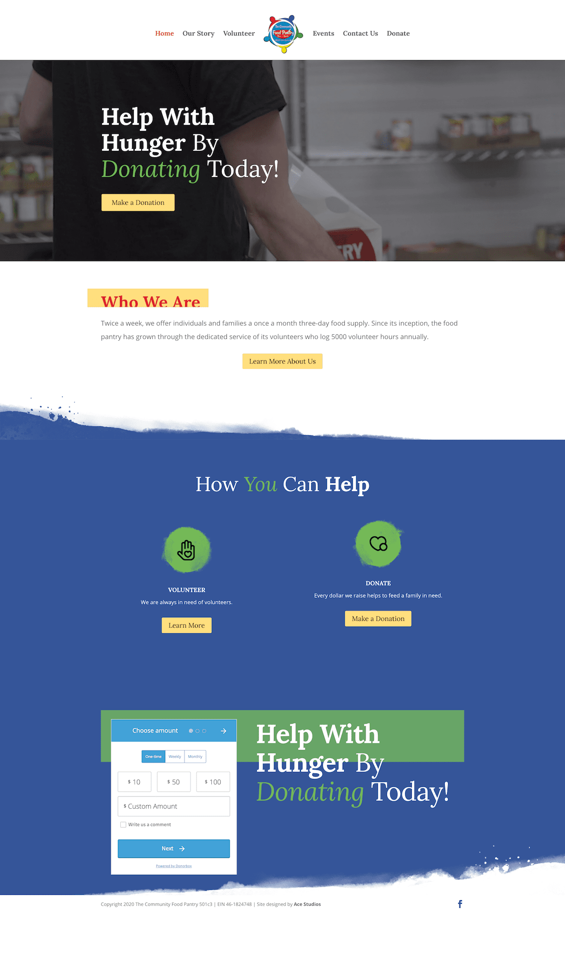
We reorganized the website's structure and navigation, creating clearer pathways for visitors to learn about the pantry's services, understand its mission, and discover opportunities to get involved.
Website Redesign and Development
Our team redesigned and developed a modern website that replaced outdated layouts with a cleaner, more approachable digital experience suited to the needs of the organization's audiences.
Website Copywriting and Content Organization
We refined and reorganized website content to communicate the pantry's mission more effectively, reducing unnecessary clutter and making important information easier to find and understand.
User Experience Improvements
We addressed navigation and usability challenges that had affected the previous website, creating a more streamlined experience for people seeking assistance and community members interested in supporting the organization.
Website Performance Improvements
We incorporated improvements intended to address the slow performance of the previous website, helping establish a more efficient browsing experience.
Brand Identity Exploration
Our creative team developed refreshed branding concepts that explored a new visual direction for the pantry. Although the organization chose to retain its existing identity, the proposed designs provided creative options for future consideration.




The Result
The Community Food Pantry of Reno/Sparks received a redesigned website that better reflected the importance of its mission and made essential information easier to access.
The project replaced the organization's outdated digital presence with a cleaner, more organized experience, addressing the navigation, content, and usability challenges that had limited the previous website.
With clearer messaging and a more intuitive structure, the pantry gained a stronger platform for communicating its services, promoting fundraising initiatives, and connecting with the Northern Nevada community.
The branding exploration also gave the organization an opportunity to consider how its identity could evolve without requiring an immediate change to its existing materials.
By balancing practical website improvements with thoughtful creative development, Ace Studios helped the pantry modernize its communications while respecting its operational needs and resources.
For an organization working to ensure that neighbors didn't have to face hunger alone, the redesigned website made it easier for the community to understand its work and find ways to help.
A clearer message, a more welcoming experience, and a digital presence better equipped to support a vital community mission.