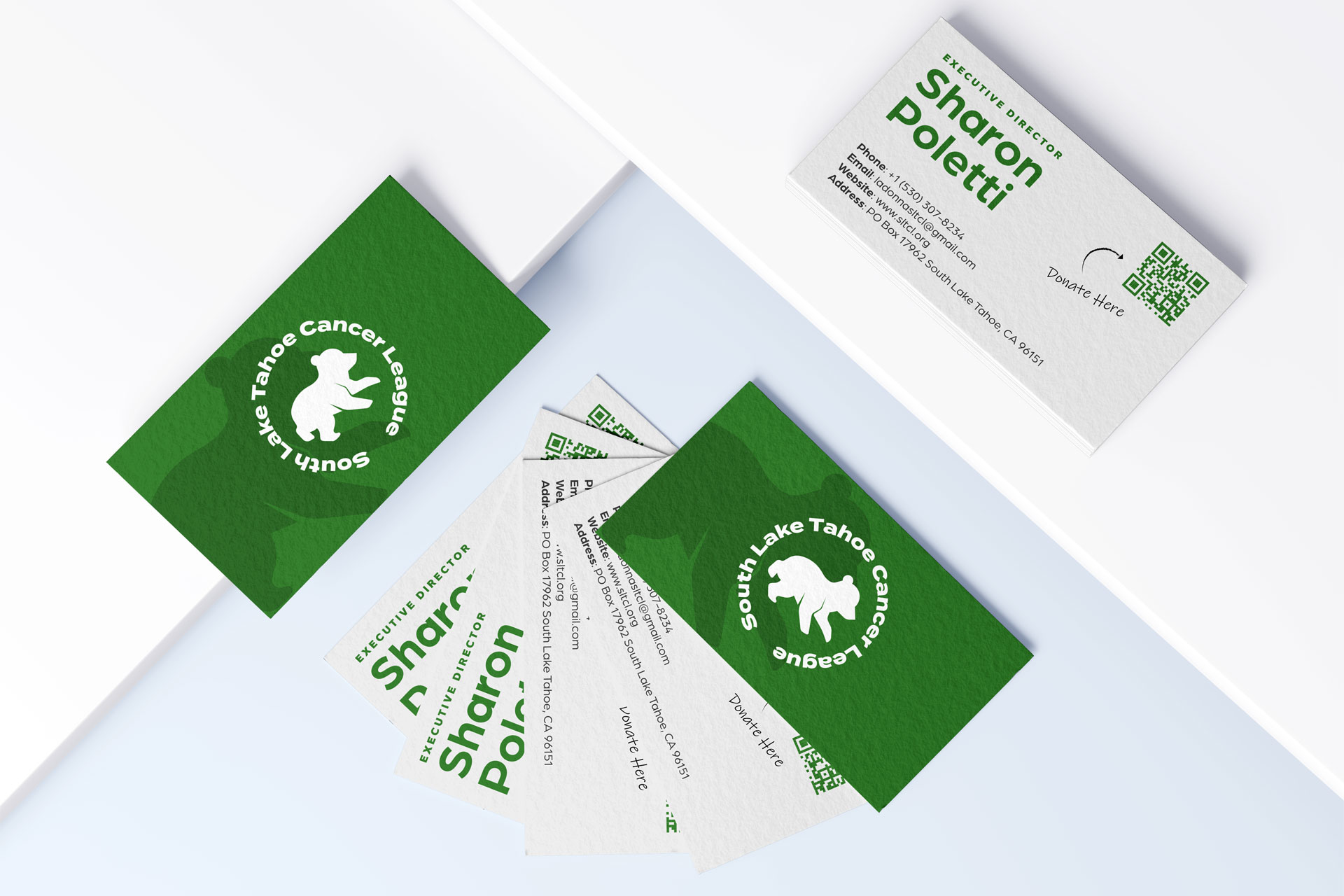
Le Capitán – Brochure Design
Case Study
Le CapitánBrochure Design
Client: AKT Development Corporation | Location: El Dorado Hills, CA
Service: Print Design + Brand Messaging
The Challenge
Le Capitán, a new luxury housing development in El Dorado Hills, CA, needed a high-end marketing piece that reflected the elegance of the property and its stunning natural surroundings. With a goal to attract serious homebuyers and investors, the client required a brochure that would:
-
Showcase available lots with clarity
-
Feature compelling imagery that captures the area’s beauty
-
Offer a seamless digital transition for inquiries via QR code
-
Incorporate the nickname “Heaven” that the area is known for
Our Solution
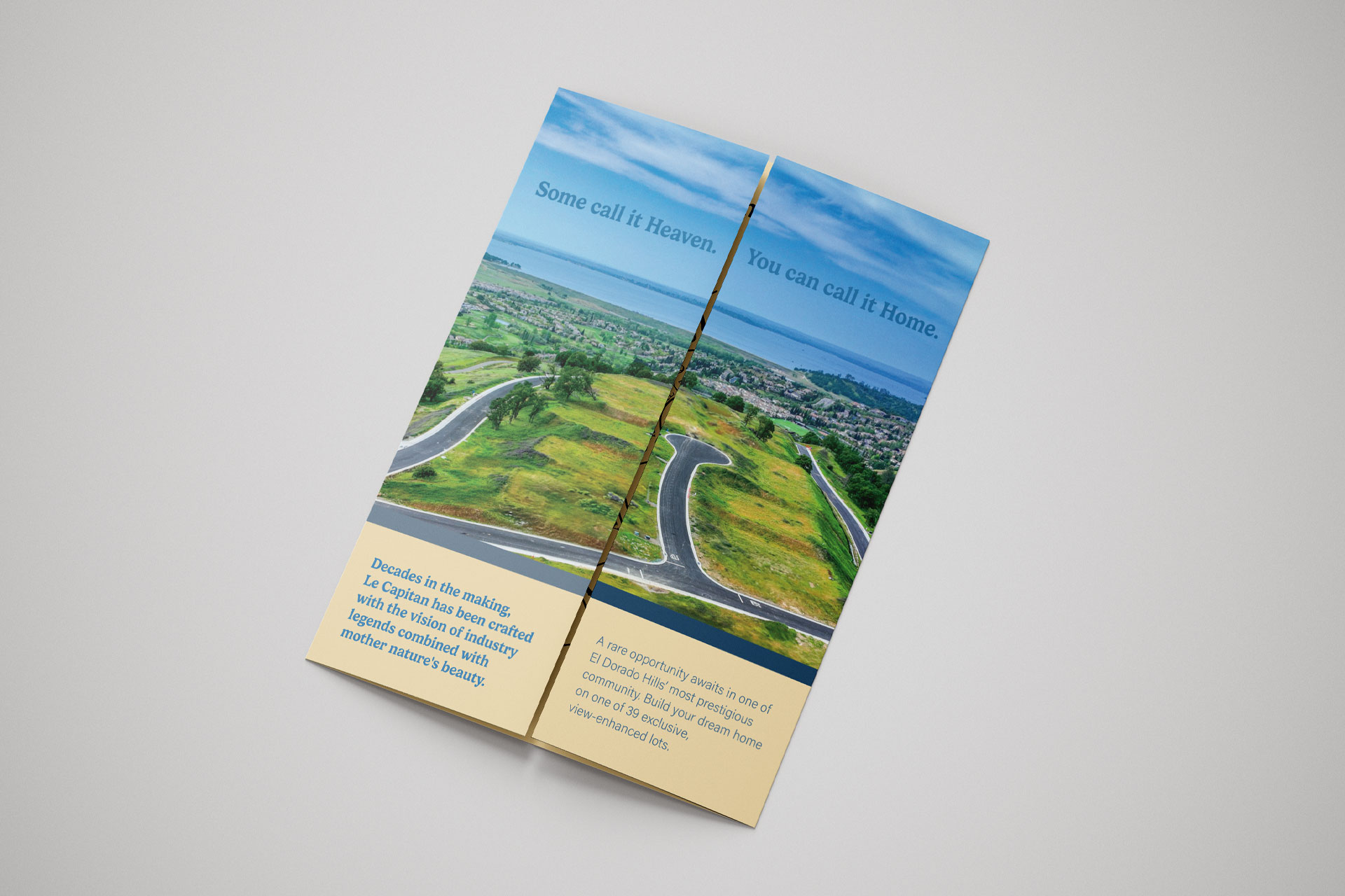
Ace Studios designed a premium closed gate fold brochure that unfolded to reveal a breathtaking aerial view of the community and nearby Folsom Lake. This cinematic reveal was anchored by the tagline:
“Some call it Heaven. You can call it home.”
—a nod to El Dorado Hills’ nickname and the emotional allure of settling in such a scenic locale.
Each inner panel featured lot availability in a clean, intuitive layout, making it easy for potential buyers to explore their options. A custom QR code on the back panel directed interested parties to a streamlined online interest form, bridging the gap between print and digital effortlessly.
Results
-
Enhanced Engagement: Prospective buyers responded positively to the elevated design and imagery, with many noting the tagline and layout as “memorable” and “aspirational.”
-
Ease of Use: The QR code feature increased online form submissions, allowing Le Capitan’s team to gather qualified leads efficiently.
-
Brand Alignment: The brochure’s elegant tone and visuals aligned perfectly with the luxury brand identity the client aimed to build.